

Top Ten Tuesday is a weekly meme hosted at The Broke & The Bookish. Each week they host a different top ten topic. This weeks is:
Top Ten Covers I Wish I Could Redesign
Now this is a good one, because even though they say don't judge a book by it's cover, we still do. If a book has a gorgeous cover, well I am more likely to pick it up and flip it over and see what it's about. If a book has an awful cover, than I am much more likely not to buy it. Not sure if I can think of ten though!

1. Almost all erotic romance covers!
They all seem to be black covers, white writing and then some random inanimate object. They are in now way exciting, or enticing and they don't make me want to pick up the book and see what it's about. I know it's good that you can look at them and know what they are about, but it's so unoriginal and boring.

2. Flame by Amy Kathleen Ryan
This cover just doesn't work for me. I really loved the cover for Glow, it looks gorgeous! Spark has quite a nice cover too, but then this one just doesn't match either of them. I think it's important that book series covers look similar, you see it and you know it is from that series. This doesn't work for me.

I actually had to go into a book store and buy Dare You To, I was mortified. Those covers are kind of atrocious. Why are they sitting on the floor, in the rain, kissing? Makes no sense and is cringe inducing. If I could, I would redesign all three of the covers.

Again, I would redesign them all. They are also cringe inducing, and way too romantic and full on for me. And what is it with all the covers of people kissing in water. Have you ever tried to kiss someone in a shower or in pissing down rain, it is not that easy! When these arrived at work I immediately shelved them, instead of putting them on the new book display.

I read this for the first time this year and had to track down a different cover. I know this is such an iconic image and so important to the story... But, my god, it just looks awful. And the colours are so wrong and it hurts my eyes. I would love to redesign it for something simpler. And I actually really loved the movie cover.

I have heard some great things, and with the movie coming out, I really wanted to at least start this series. But every time I see it on the shelf at my library, I can't pick it up. The cover is not enticing and it doesn't make me need to pick up this book and read it. Also, I think the girl looks like a young Angeline Jolie in this as well.

Yes the book is called Uglies, but this doesn't mean it has to have an ugly cover. Plus. this cover is not just ugly but creepy as well. This series has had several cover redesigns, but so far I haven't really liked any of them.
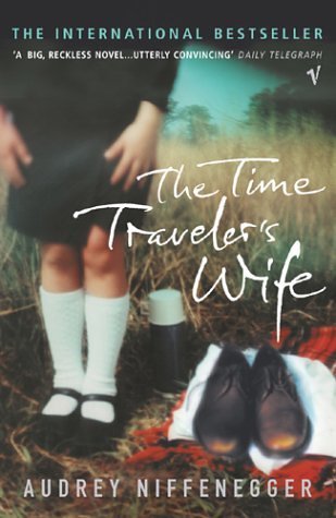
I love the book, hate the cover. Like so many covers on the list, it's just boring. When a book is as amazing as this, I really wish it had a cover to match!
Two Covers I Wish I'd Designed


9.These Broken Stars by Amie Kaufman & Meagan Spooner
AND
These covers are both amazingly stunning and I wish I could have been the one to design both. They instantly caught my attention, made me pick up/request the book, and I wasn't left disappointed.
On The Blog This Week:
Thank you to these wonderful people who followed me:
Thank you all so much!
Feel free to enter my giveaway, earn an entry a day by tweeting about it as well.


Great choices this week. I completely agree with you about erotic romance books.
ReplyDeleteI know, I don't read them but the covers just make them all looks the same!
DeleteHaha! Nice! The comment you made about Vampire Academy I saw on another blog! I've noticed that too. Although they have re-re-designed the covers again with a newer look. I don't think the cover model is on them anymore, or if she was it was a very faded and blended in look. Also I think they made them that way so adults could read them without feeling guilty for reading YA!
ReplyDeleteHere's my Tuesday Post
Have a GREAT day!
Old Follower :)
I know, I've seen that so many others thought that as well, which is good because she is definitely her doppelgänger! I've seen some red and black covers, but they aren't that great either. Hoping for a redesign in time with the movie.
DeleteYou're so right, that cover model does look like Angelina Jolie. I agree with all your choices, especially the Perfect Chemistry books. It's like the models are both seconds away from falling out of their car windows.
ReplyDeleteI know, if only! I think she's her doppelgänger.
DeleteOh great picks! The Great Gatsby looks really odd and creepy.
ReplyDeleteHappy reading!
It freaked me out and I had to hunt down and buy a different one.
DeleteI love that cover of Glow. I wasn't a fan of the book but that cover is so much better than the one I had. And that cover of Uglies is AWFUL! What's with the kidney shaped dish and the doll parts? The book is so much more than that.
ReplyDeleteThanks for stopping by my blog.
My TTT List
I really didn't get the Uglies cover either, it really freaked me out and doesn't do the content of the book justice! I thought the Glow cover was so stunning, glad that's the one I got as the the other two are kind of awful.
DeleteYes the erotic/romance genre has gone from really cheesy covers to super boring and bland covers. Can't we find something in between?
ReplyDeleteYeah, I don't read them and I think they are better than ones with half naked people all over them; but still I think they could do better. Maybe if they added a bit more colour to some of them.
DeleteI totally agree with you about Dare You To. I love that book, but the cover is just terrible. I would love to own it, but honestly I just don't want that sitting on my shelf.
ReplyDeleteI know, I have it now and may have to hide it right at the back!
DeleteSo agree with the erotica covers they're all pretty bad!
ReplyDeleteJaime @ Two Chicks On Books
They need to try a bit harder with those, they all look the same!
DeleteLOL at all the erotica covers. Totally agree, they are so lame. They should put naked people or something so we know what we are getting ourselves into.
ReplyDeleteand omg, I've never seen that cover of Uglies before but I'm pretty sure I just threw up in my mouth a bit. The copy I have has a much better cover.
That Uglies cover is one of the ugliest covers I have ever seen on a book! Ha that would be a better idea for erotic covers, but I'd still probably hate them.
DeleteI actually don't mind the covers to the Perfect Chemistry series. And I like GREAT GATSBY's, too--when I ever see it, I think of the book; it's iconic. Vampire Academy is such a huge series and I don't know why the covers aren't better. The people are odd--on Bloodlines, too. Thanks for stopping by!
ReplyDeleteRachel @ Beauty and the Bookshelf
I know it's iconic, but it still creeps me out! VA, I hope if they get new covers with the movie release I will be able to buy and read them then.
DeleteI have never seen that version of Uglies and I have to say it is disturbing! Who approved that?!?!?! I agree about The Time Traveler's Wife. Loved the book, hate the cover. The US one is even worse. And those erotica books: BLAH!!!!
ReplyDeleteThanks for stopping by My TTT
I have no idea who gave the approval of that, but I hope they got fired! I think an amazing book like The Time Traveller's Wife should have a gorgeous cover to match!
DeleteI agree on pretty much all of these! The erotica covers are really bad indeed. I wouldn't know what else to put on those covers, though, because I don't like half-naked guys on the cover either, lol. What I think is funny, is that the Twilight covers look exactly like that (black with an object) and they're not erotic at all, haha. Thanks for visiting my blog! :)
ReplyDeleteI don't like half naked guys on covers either! I think they need a bit more colour, just so they don't all look identical! I know, I think they are modelled on those covers, but not sure why they chose to do it.
DeleteI love the cover of These Broken Stars more than I actually like the story. I give the person who designed this cover a standing ovation. Bravo. It's one that you need to hug.
ReplyDeleteThanks for stopping by!
Aly @ My Heart Hearts Books
I know, it's absolutely stunning and what made me pick up the book. I kind of feel I liked the cover more too, it's that amazing.
DeleteLots of good selections on your list. I am totally with you on the erotica covers. I just don't get the draw of the random inanimate object.
ReplyDeleteMy TTT is here.
Neither do I, they need to come up with something better than that.
DeleteThese Broken Stars has a GORGEOUS cover!
ReplyDeleteThanks for stopping by my TTT!
You're welcome.
DeleteThere are SO many different covers for the Uglies, but I still don't love any of them. Some are alright, but some are just awful - normally the ones involving Barbie parts, like the one you have, which are just CREEPY.
ReplyDeleteAnd the model on Vampire Academy's cover totally makes me think of Angelina Jolie; I read those books as ebooks from the library, which is due in a small part to the covers... ;)
Creepy indeed, when I saw it for the first time I didn't want to pick the book up and read it. I think I may wait for a VA revamp when the movie comes out before I pick them up for myself!
DeleteThanks for stopping by! I love the Uglies series (ok, the first 3) but you are right about all the different covers...not so great.
ReplyDeleteHeehee, I read the first three but could not get into the 4th one and ended up setting it down, so no idea what happens in that one.
DeleteKatie McGarry's books try to look like Simone Elkeles' Perfect Chemistry books. I don't like holding these books and reading them. Same with Stephanie Perkins. Ugh. Where's a book sock when you need one!? So many people mentioned Vampire Academy today!! It's the big winner. I like the newest US rendition of UGLIES the best, but still not a favorite, agreed. I love that you added a few good covers. Wish I'd done that!
ReplyDeleteI agree! This is what Kindles were made for, so you can read all the books with embarrassing covers without anybody seeing it! I thought I would give some pretty covers, after all the hideous ones!
DeleteGreat list!
ReplyDeleteThere definitely is so many cheesy looking covers for YA contemp. books. Which is sad, because a lot of them are quite a bit gritter than some teenage romance.
Very true, I wish the covers weren't so off putting!
DeleteHaha, so agreed about all erotic/romance covers! I just don't want people going at it on my book cover >.>
ReplyDeleteMe either, I don't want to be seen reading them in public.
DeleteI completely agree about the McGarry and Elkeles books. I also think they are too easily confused with each other.
ReplyDeleteThey're really similar and equally embarrassing to be spotted reading!
DeleteHa ha ha! I so agree about the erotic/romance covers. They're all horrible. They're either way embarrassing and ugly, or they have nothing to do with the story and are boring.
ReplyDeleteAnd, I agree about The Great Gatsby. I like over covers I've seen better.
I know, I think the bland erotic ones need to be more individual with more colour; I won't be tempted to read them but at least they'll look better. I hate embarrassing covers with models going at it on the front, I don't want to be seen reading them in public.
DeleteI totally agree about erotica covers. They all look the same to me. I've actually never seen that cover of Uglies. I think there's a few different covers for that series floating around. VA covers suck. I haven't read the series yet, but have heard great things. But those covers.... Omg These Broken Stars. I love that cover so much! And I've heard great things about it so far. I have an ARC so I will be picking it up soon. :)
ReplyDeleteI've seen loads of covers for Uglies, don't really like any of them but this was the only one I could find when I first read them, it actually put me off getting the books. I've got the plain black covers with bright writing now.
DeleteI hope you really enjoy These Broken Stars! I thought it was a great start to a series.
I feel the same way about the Pushing the Limits and Perfect Chemistry books. Ick. The same with The Vampire Academy. It’s supposed to be some great series and the covers really don’t reflect that. I really love the These Broken Stars cover as well. So pretty.
ReplyDeleteI haven't been able to give VA a chance yet, the covers put me off that much. These Broken Stars is one of the most beautiful book covers I have ever seen.
DeleteGreat picks! I think almost everyone had VA on their lists today! :D Maybe the publisher will get the hint and do something about them!
ReplyDeleteOH I agree with you on These Broken Stars, one of the best this year!
Ha I hope so! I'm hoping the movie release will bring about a revamp of them all! Then I might finally be able to read them.
DeleteI totally wish I had designed those covers too! I definitely prefer that Glow cover to the pink one!
ReplyDeleteThanks for stopping by my blog :)
I haven't seen the pink one, I've seen the one that just has Glow written on it, it's really bad! Glad I found that one, it's so gorgeous.
DeleteI think they made erotic novels covers generic because they think women will be less embarrassed to read them in public. I guess it has some weird kind of sense but still they so boring.
ReplyDeleteVampire Academy definitely has very generic and boring covers.
Uglies cover is... ugly and weird.
I love both examples of good covers design you posted.
Thanks for stopping by my TTT.
It does make sense and I think that is true, but they all look the same and so now everyone associates them with erotic fiction so it is kind of a moot point now. I think they need to be a bit more individual and have a bit more colour.
DeleteEw, that cover of Uglies is pretty ugly. I'm pretty okay with the rest though, although the recurring theme on erotic covers could have a serious redesign. And my my! These Broken Stars is such a pretty cover- the sole reason why I want to read that book. That's a fab list you have up there.
ReplyDeleteThanks for stopping by my post earlier. Happy reading and have a great week ahead!
Sarika @ The Readdicts
The covers don't bother me too much, I had to think hard to pick them. I really do think the erotic one could do with being a bit more individual, I hate shelving them at work - every single spine is black in the erotic romance section! It's so boring.
DeleteI totally agree with VA, I adore that series but not the biggest fan of the covers. These Broken Stars is gorgeous and the book is amazing. Great list!
ReplyDeleteTeresa @ Readers Live A Thousand Lives
I will give the series a try soon, I hear amazing things but get put off by the ugly covers! Hopefully the movie will bring about a revamp of them.
DeleteI actually really like Dare You To's cover (all though, the version where he has a blue shirt). But I'm not a fan of Crashing into You. Great list! And I wish I had designed These Broken Stars too. It's gorgeous!
ReplyDeleteI don't really get why they felt the need to change his shirt colour for the UK one. These Broken Stars has to be one of the prettiest covers I have ever seen.
DeleteGreat list! I love those you wish you'd redesign, they're so pretty!
ReplyDeleteThanks for stopping my post yesterday!
Happy reading!
You're welcome, thanks for coming to check mine out too.
DeleteDefinitely agree with your number 1!! And that Uglies cover is creepy! Haven't seen that version of the cover before. Thanks for stopping by my post as well.
ReplyDeleteIt looks even more hideous when you're holding it! I don't know why they ever thought that was a good idea.
DeleteThank you so much for checking out my TTT post over at The Flyleaf Review! It was my first! :)
ReplyDeleteI have to agree with you on the erotic romance covers --they all look so damn similar; I've never read one, and those covers are partly to blame. YES to the Angelina Jolie reference! I actually thought it was her when I first saw the book! lol The covers for These Broken Stars and Glow are sooo gorgeous! I'm definitely purchasing TBS when it releases --and it has everything to do with the cover (and the cool concept behind it).
I don't read them either but see them all the time at work, all the spines in the erotic fiction section are all black - it's so boring! I thought it was Angelina Jolie too, took me a while to figure out it wasn't. It's a great story so I hope you enjoy TBS.
DeleteLol... love the collage you did with the erotica novels. I know romance are similar, but I had never realized erotica copied covers as well. Meh.
ReplyDeleteThanks for stopping by my TTT :)
Yeah, they all look the exact same; need to be a bit more individual. I shelve them at work and every single erotic fiction spine is black, it looks so dull and boring.
DeleteI agree with the erotic books and also Gatsby and Uglies are atrocious. Thanks for stopping by :)
ReplyDeleteI know, I don't know who thought they were good ideas to begin with. Thanks for checking mine out too.
DeleteI'd never been able to get erotic covers.They never match the story.And sometimes when I see a book with a ribbon,jewelry or other ornaments,I stay away from them as most of them are erotic books.
ReplyDeleteMe too, which is a real shame because some really great stories have covers like that and they aren't erotic romance books, but people don't ever pick them up because they assume they are.
DeleteAll of those erotic covers are so copy cat, BUT...they are certainly preferable to the alternative of two half-naked people groping each other. I agree, too, on the McGarry covers. I've got Dare You To, and I'm a bit embarrassed to have even the spine showing on my bookshelf.
ReplyDeleteStephanie @ Inspiring Insomnia
I am so happy to see a positive review of this!!!Many thanks!
ReplyDeleteBookYap Reviews